____
Brand development
Lucy
____
In 2019, Lucy relaunched their e-commerce site as part of a full company rebrand, bringing the alternative nicotine company into a sophisticated, modern and approachable world. The team at Lucy encouraged us to push beyond the initial website deliverables to discover the tone and voice that matched the company's core mission. With a new brand guide in hand, we developed the design language to visually conceptualize the flavors as well as environments that house the packaging throughout the site.
____
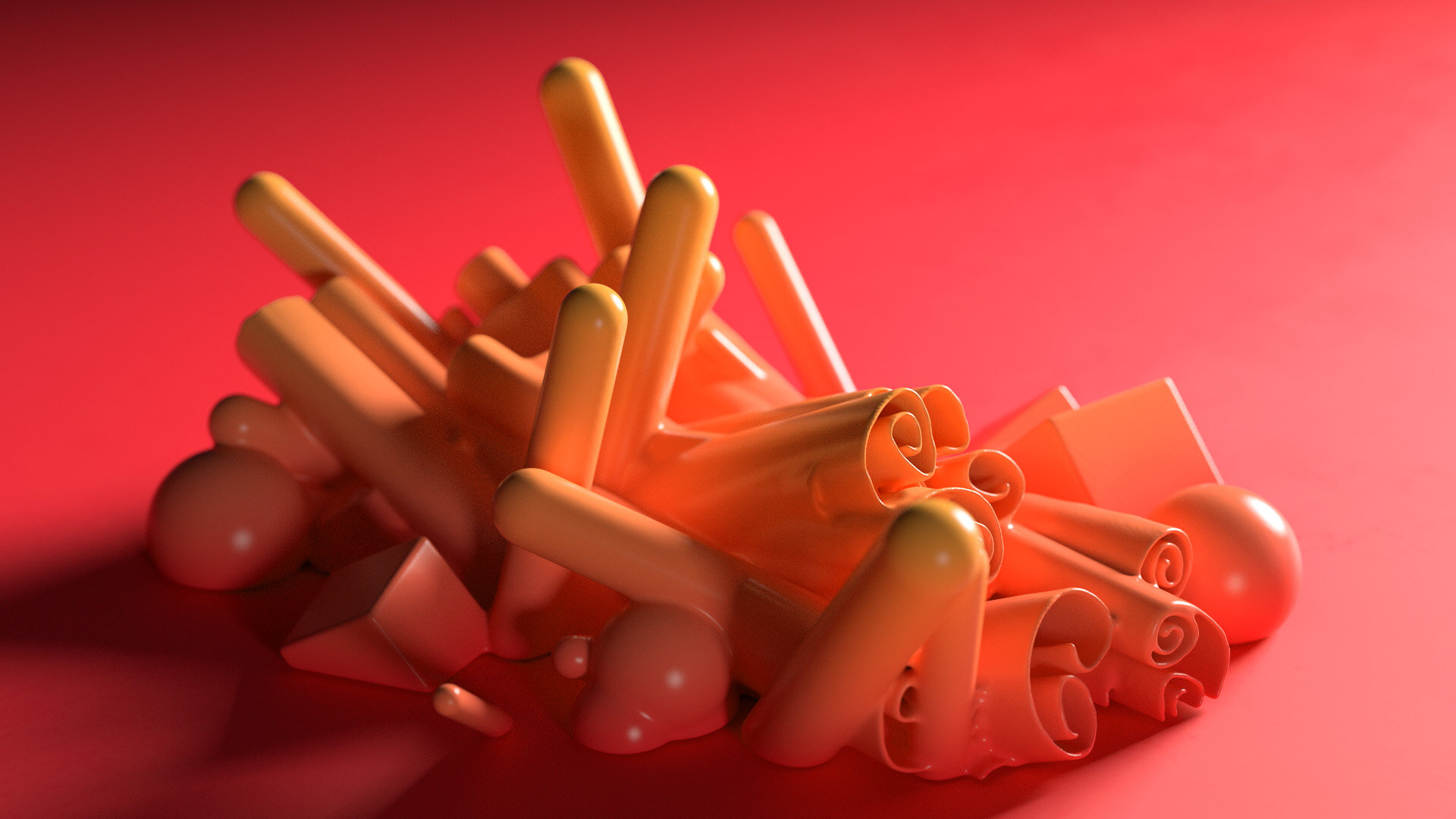
We loved the idea of living in bright world and strategically using color to complement each of the gum flavors.
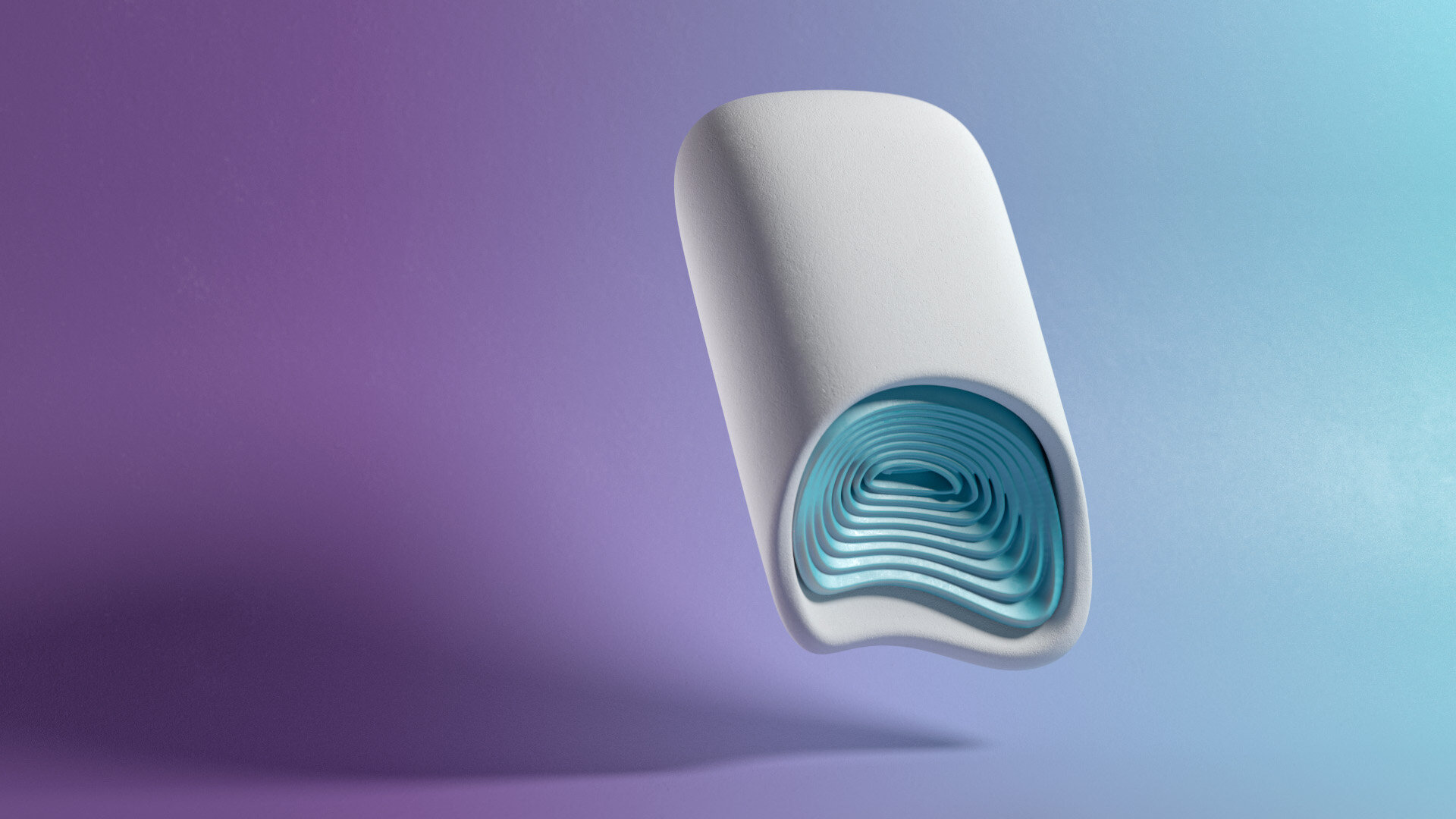
With this project, we wanted to go beyond standard packaging rendering and deliver something that was artistic and memorable.


____
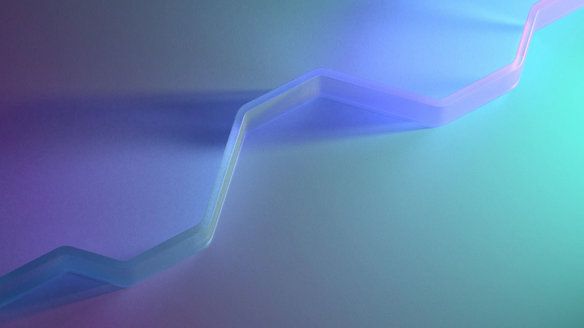
A motif that we anchored around is the diagonal feature line that is present in the background environments.
____
This acted as a subtle nod to the product packaging and also added a lot of visual weight to the composition.


____
Process






-
Creative | Design | Direction Ranger & Fox
Design Nejc Polovsak


