
____
‘Wayne’ Show Branding
Youtube Red & Endeavor Content
____
When the folks at Endeavor Content told us to blast some Black Sabbath for inspiration, we threw on some cut-offs, permed our hair, painted our fingernails black and dove head first into the project. The ask was for us to develop the visual language for the new Youtube original series ‘Wayne.’ The title character has punk and metal coursing through his veins with zero f***’s given, and the logo needed to match his intensity.

____
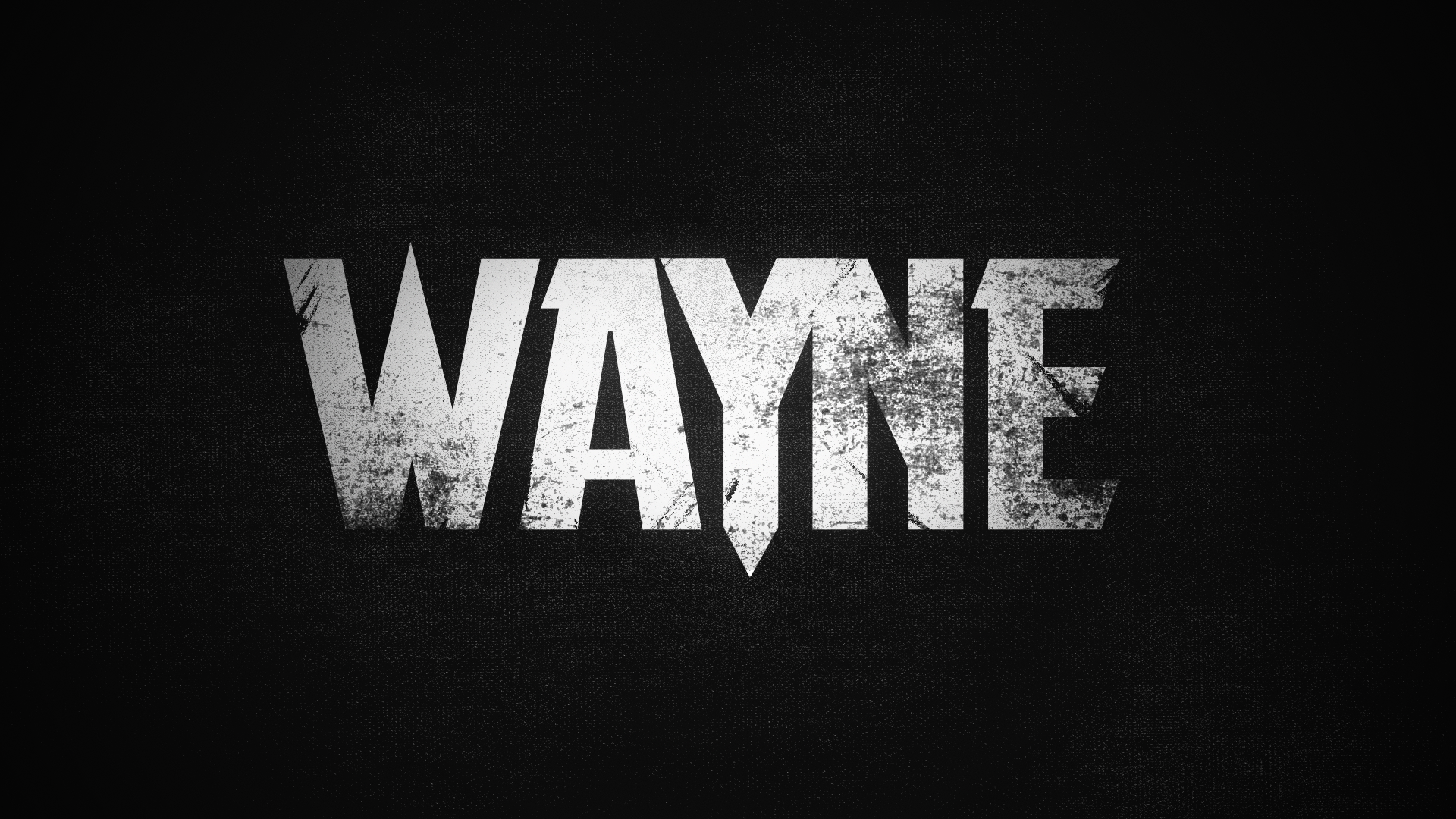
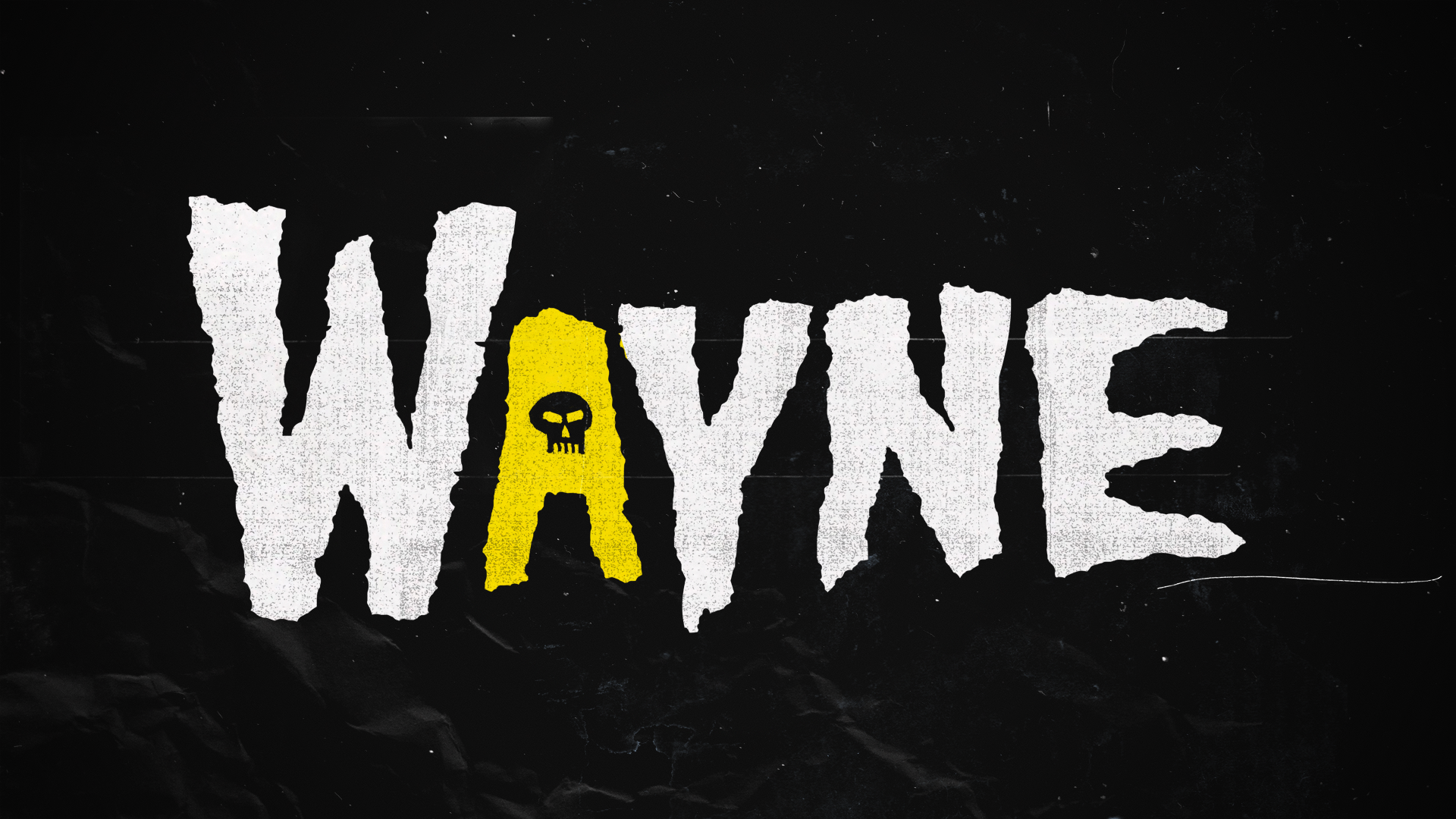
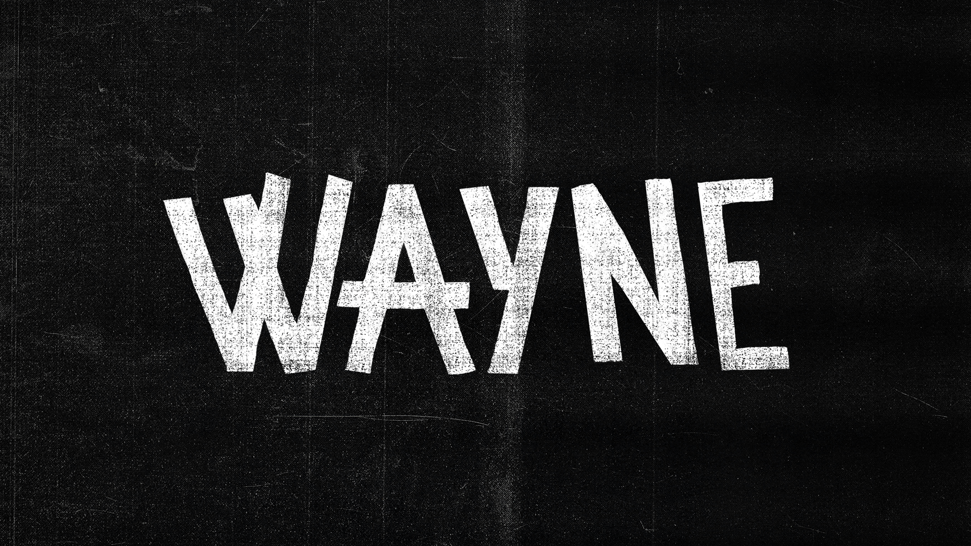
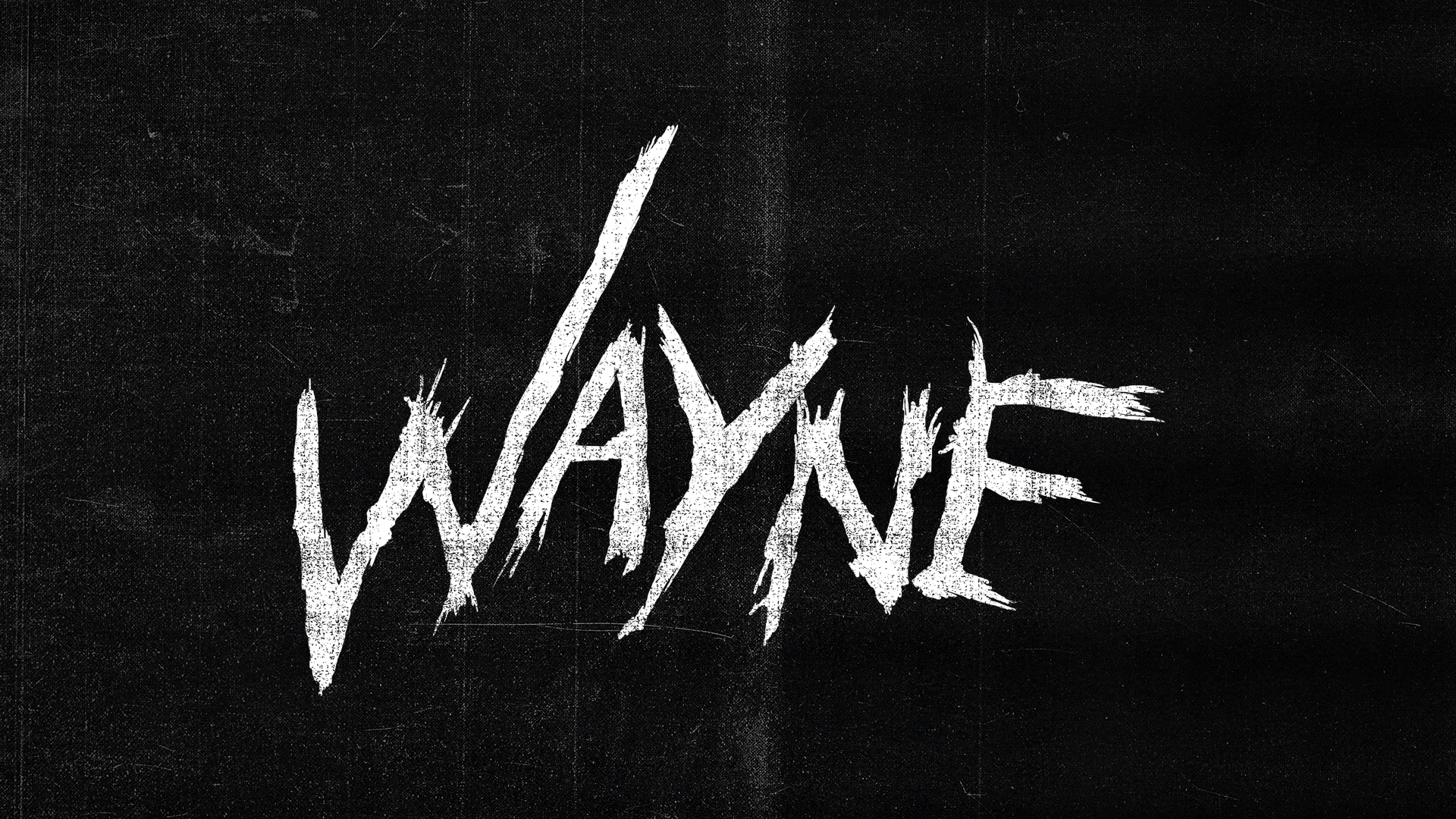
For us, bold in-your-face typography was the perfect approach. We dug deep into 80’s metal concert artwork for inspiration for our logo exploration, making sure to capture the grit and nostalgia of the era while also being conscious to not take things too seriously. Each episode starts with a cold opener, and as the opening scene builds to its climax, the rock gods’ guitars shred apart the scene, which is punctuated with the full-frontal logo, beginning each episode on an epic note.
Logo development


-
Creative | Design | Direction Ranger & Fox